
On a bird song spectrogram, time runs from left to right, frequency or pitch runs from low at the bottom to high at the top, and darker or brighter marks generally represent stronger acoustic energy. Read the overall phrase first, then inspect note direction, spacing, repetition, and frequency range while replaying the sound.
The three dimensions of a spectrogram
A spectrogram begins with a physical event: air sets soft tissues vibrating in the bird's syrinx, and the resulting sound is shaped by the rest of the vocal tract before it reaches a microphone.
Horizontal position: time
The left edge is earlier and the right edge later. A short vertical mark is a brief sound spanning several frequencies; a long horizontal mark is a sustained pitch. Empty space shows silence or energy below the display threshold.
Vertical position: frequency
Higher marks represent higher frequencies, which usually correspond to higher perceived pitch. The vertical scale is commonly shown in kilohertz (kHz). Bird sounds can contain a fundamental frequency plus harmonics above it, so one note may appear as several parallel traces.
Color or darkness: intensity
Stronger energy appears more prominent, depending on the color palette. This is not a simple measure of how loudly the bird sang: distance, microphone direction, gain, wind, and other sounds all affect the recording.
Translate visible shapes into listening questions
- Rising or falling sweep: Can you hear the pitch glide upward or downward?
- Stack of parallel lines: Does the note sound rich or tonal because energy occurs at harmonic frequencies?
- Dense vertical stroke: Is there a brief click, chip, or broad noisy note?
- Evenly repeated units: Can you tap the pulse or count the number of notes per phrase?
- Wide fuzzy band: Does the sound have a rough, buzzy, or broadband quality?
- Alternating shapes: Does the bird switch between two note types or phrase forms?
Do not begin by measuring every mark. First recognize the phrase silhouette. A repeated row of clear whistles and an irregular tangle of thin warbling notes create different visual organizations before individual details are named.
Three real bird song spectrograms
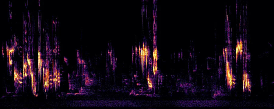
Follow one thin trace at a time. The frequent direction changes and uneven gaps help explain why the song feels delicate and improvised rather than metronomic.
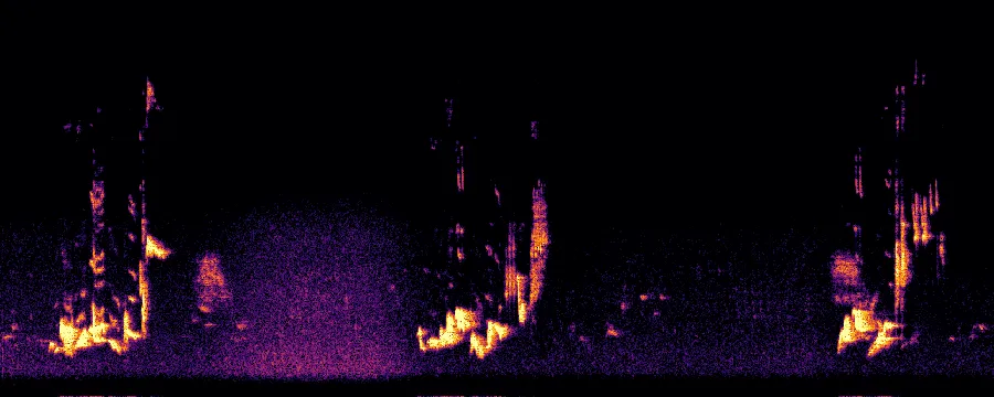
Notice the phrase boundaries before the fine notes inside them. Those spacious divisions support the impression of measured, fluted delivery.
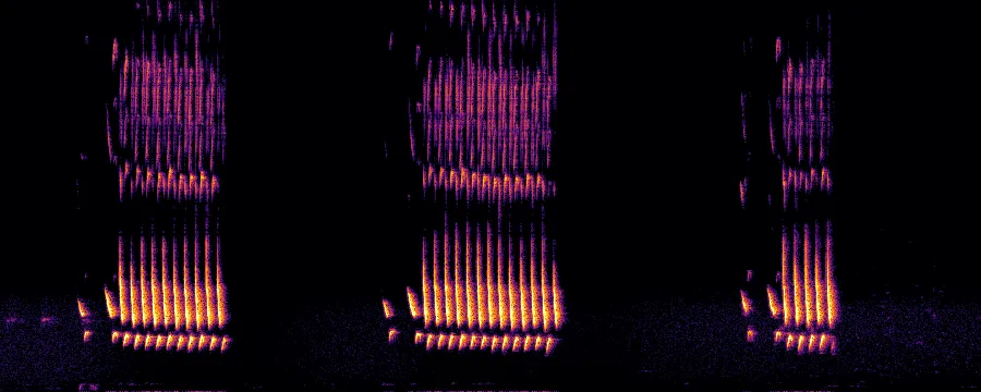
Repeated contours let you predict when the next note will arrive. That regularity is an effective retrieval cue, even when another Cardinal uses a different phrase from its repertoire.
A five-pass listening workflow
- Listen without looking. Describe pitch, pace, repetition, and tone in ordinary words.
- Scan the whole image. Find phrase boundaries and the broad frequency range.
- Replay and trace. Follow a repeated note or pitch sweep with your finger or eyes.
- Hide the image. Listen for the newly visible feature using sound alone.
- Compare another recording. Identify which shapes and acoustic properties remain stable.
This works especially well for two birds you confuse. Place their spectrograms side by side, choose one structural difference, and then test the contrast with images hidden.
What a spectrogram cannot tell you by itself
Display settings influence the result. Frequency range, window size, contrast, noise reduction, and file compression can make the same sound look different. Background insects, wind, people, and other birds also leave marks. A clean shape is not automatically the target species.
Species identification still needs location, habitat, season, behavior, and awareness of repertoire and geographic variation. Use a spectrogram to test an acoustic hypothesis, not to bypass field context.
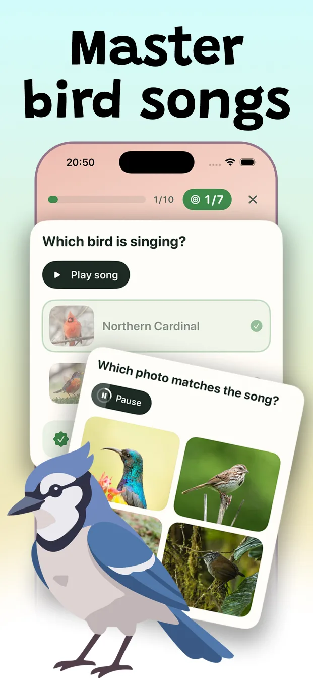
Syrinx mixes spectrogram matching with sound, photo, and name recall so the visual cue always returns your attention to listening.
Download Syrinx on the App Store →See these examples in motion in the three-bird sound quiz, or apply them to the full field identification checklist.